> ## Documentation Index
> Fetch the complete documentation index at: https://docs.custral.com/llms.txt
> Use this file to discover all available pages before exploring further.
# Donut Chart
> Categorical share-of-whole with a centered metric.
 ## When to use
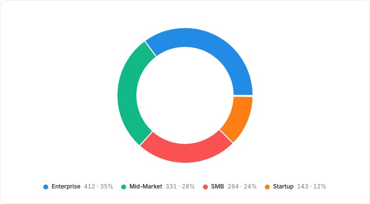
Donut charts answer "what share of the total is X?". Use them when you have a single categorical breakdown of a single measure and want to communicate proportion. The donut shape leaves a center for a headline metric.
## Required data shape
* **Group**: a select / status property.
* **Value (optional)**: numeric property aggregated per group; defaults to record count.
## Configuration
| Setting | What it does |
| ------------ | --------------------------------------------------------------------- |
| Group by | The property whose values become the donut segments. |
| Value | The numeric value aggregated per segment. Defaults to a record count. |
| Aggregation | How values roll up: Count, Sum, or Average. |
| Center label | The headline metric shown in the donut's center. |
## Limitations
* Five or fewer categories. More than that, switch to a Bar chart.
* Donuts are notoriously bad at showing precise differences. Use them for ratios, not exact numbers.
## Related topics
- [Pie Chart](/bi/reporting/charts/pie.md)
- [Chart drill-down](/bi/reporting/drill-down.md)
- [Treemap](/bi/reporting/charts/treemap.md)
- [BI Best Practices](/bi/best-practices.md)
- [Reporting](/bi/reporting/overview.md)
## When to use
Donut charts answer "what share of the total is X?". Use them when you have a single categorical breakdown of a single measure and want to communicate proportion. The donut shape leaves a center for a headline metric.
## Required data shape
* **Group**: a select / status property.
* **Value (optional)**: numeric property aggregated per group; defaults to record count.
## Configuration
| Setting | What it does |
| ------------ | --------------------------------------------------------------------- |
| Group by | The property whose values become the donut segments. |
| Value | The numeric value aggregated per segment. Defaults to a record count. |
| Aggregation | How values roll up: Count, Sum, or Average. |
| Center label | The headline metric shown in the donut's center. |
## Limitations
* Five or fewer categories. More than that, switch to a Bar chart.
* Donuts are notoriously bad at showing precise differences. Use them for ratios, not exact numbers.
## Related topics
- [Pie Chart](/bi/reporting/charts/pie.md)
- [Chart drill-down](/bi/reporting/drill-down.md)
- [Treemap](/bi/reporting/charts/treemap.md)
- [BI Best Practices](/bi/best-practices.md)
- [Reporting](/bi/reporting/overview.md)