> ## Documentation Index
> Fetch the complete documentation index at: https://docs.custral.com/llms.txt
> Use this file to discover all available pages before exploring further.
# Line Chart
> Trend over time.
 ## When to use
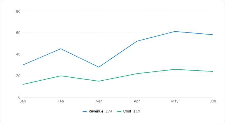
Line charts are the right tool for "how did X change over time" questions. Use them for deal velocity, ticket throughput, NPS over weeks: any continuous trend.
## Required data shape
* **X axis**: a date or ordered numeric property.
* **Y axis**: a numeric or aggregated property.
* **Group (optional)**: select property; each group becomes its own line.
## Configuration
| Setting | What it does |
| ----------- | ------------------------------------------------------------------- |
| X-axis | The date or ordered property plotted along the horizontal axis. |
| Y-axis | The numeric value (or aggregation) plotted along the vertical axis. |
| Group by | An optional property whose values each become their own line. |
| Time bucket | How dates are grouped: hour, day, week, or month. |
## Limitations
* More than \~5 series in one chart becomes hard to follow. Use Composite or split charts.
* Sparse data leaves visual gaps; consider Area for cumulative views.
## Related topics
- [Area Chart](/bi/reporting/charts/area.md)
- [Sparkline](/bi/reporting/charts/sparkline.md)
- [Stat card](/bi/reporting/stat-card.md)
- [Assemble a support inbox](/recipes/support-inbox.md)
- [Composite Chart](/bi/reporting/charts/composite.md)
## When to use
Line charts are the right tool for "how did X change over time" questions. Use them for deal velocity, ticket throughput, NPS over weeks: any continuous trend.
## Required data shape
* **X axis**: a date or ordered numeric property.
* **Y axis**: a numeric or aggregated property.
* **Group (optional)**: select property; each group becomes its own line.
## Configuration
| Setting | What it does |
| ----------- | ------------------------------------------------------------------- |
| X-axis | The date or ordered property plotted along the horizontal axis. |
| Y-axis | The numeric value (or aggregation) plotted along the vertical axis. |
| Group by | An optional property whose values each become their own line. |
| Time bucket | How dates are grouped: hour, day, week, or month. |
## Limitations
* More than \~5 series in one chart becomes hard to follow. Use Composite or split charts.
* Sparse data leaves visual gaps; consider Area for cumulative views.
## Related topics
- [Area Chart](/bi/reporting/charts/area.md)
- [Sparkline](/bi/reporting/charts/sparkline.md)
- [Stat card](/bi/reporting/stat-card.md)
- [Assemble a support inbox](/recipes/support-inbox.md)
- [Composite Chart](/bi/reporting/charts/composite.md)