> ## Documentation Index
> Fetch the complete documentation index at: https://docs.custral.com/llms.txt
> Use this file to discover all available pages before exploring further.
# Radar Chart
> Multi-dimensional comparison on a polygon.
 ## When to use
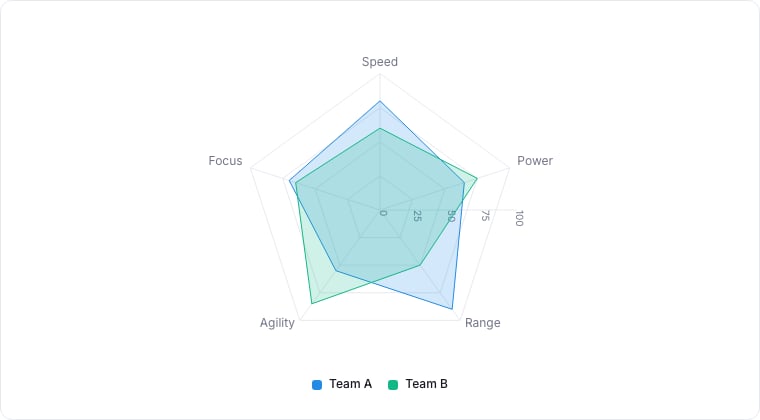
Radar charts plot many metrics around a polygon. Use them to compare two or three records (or two or three time periods) across the same set of metrics: sales rep skills, account health dimensions, customer profile attributes.
## Required data shape
* **Axes**: 3+ numeric properties to plot per axis.
* **Series**: each series is one record (or one group); 1-3 series ideal.
## Configuration
| Setting | What it does |
| --------- | ------------------------------------------------------------ |
| Axes | The numeric properties plotted on each spoke of the polygon. |
| Series | The property that identifies each series (often the record). |
| Normalize | Scales every axis to a common 0–1 range for fair comparison. |
## Limitations
* Three or more series get tangled. Use small-multiples instead.
* Axis order matters visually, adjacent metrics imply correlation that may not exist.
## Related topics
- [Chart drill-down](/bi/reporting/drill-down.md)
- [Reporting](/bi/reporting/overview.md)
- [Bar Chart](/bi/reporting/charts/bar.md)
- [Bubble Chart](/bi/reporting/charts/bubble.md)
- [Line Chart](/bi/reporting/charts/line.md)
## When to use
Radar charts plot many metrics around a polygon. Use them to compare two or three records (or two or three time periods) across the same set of metrics: sales rep skills, account health dimensions, customer profile attributes.
## Required data shape
* **Axes**: 3+ numeric properties to plot per axis.
* **Series**: each series is one record (or one group); 1-3 series ideal.
## Configuration
| Setting | What it does |
| --------- | ------------------------------------------------------------ |
| Axes | The numeric properties plotted on each spoke of the polygon. |
| Series | The property that identifies each series (often the record). |
| Normalize | Scales every axis to a common 0–1 range for fair comparison. |
## Limitations
* Three or more series get tangled. Use small-multiples instead.
* Axis order matters visually, adjacent metrics imply correlation that may not exist.
## Related topics
- [Chart drill-down](/bi/reporting/drill-down.md)
- [Reporting](/bi/reporting/overview.md)
- [Bar Chart](/bi/reporting/charts/bar.md)
- [Bubble Chart](/bi/reporting/charts/bubble.md)
- [Line Chart](/bi/reporting/charts/line.md)