> ## Documentation Index
> Fetch the complete documentation index at: https://docs.custral.com/llms.txt
> Use this file to discover all available pages before exploring further.
# Scatter Chart
> Two-dimensional plot for relationships and outliers.
 ## When to use
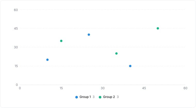
Scatter charts plot one numeric metric against another, one dot per record. Use them to spot relationships, outliers, and clusters: deal value vs days-in-stage, NPS vs MRR.
## Required data shape
* **X axis**: numeric property.
* **Y axis**: numeric property.
* **Color (optional)**: select property to color dots by category.
## Configuration
| Setting | What it does |
| --------- | ------------------------------------------------- |
| X-axis | The metric plotted along the horizontal axis. |
| Y-axis | The metric plotted along the vertical axis. |
| Color by | An optional property whose values color the dots. |
| Trendline | Draws a best-fit line through the points. |
## Limitations
* More than \~500 dots becomes a noisy cloud. Add a filter or sample.
* The trendline is a simple linear regression; treat it as a visual aid, not statistical truth.
## Related topics
- [Bubble Chart](/bi/reporting/charts/bubble.md)
- [Chart drill-down](/bi/reporting/drill-down.md)
- [Reporting](/bi/reporting/overview.md)
- [Bar Chart](/bi/reporting/charts/bar.md)
- [Line Chart](/bi/reporting/charts/line.md)
## When to use
Scatter charts plot one numeric metric against another, one dot per record. Use them to spot relationships, outliers, and clusters: deal value vs days-in-stage, NPS vs MRR.
## Required data shape
* **X axis**: numeric property.
* **Y axis**: numeric property.
* **Color (optional)**: select property to color dots by category.
## Configuration
| Setting | What it does |
| --------- | ------------------------------------------------- |
| X-axis | The metric plotted along the horizontal axis. |
| Y-axis | The metric plotted along the vertical axis. |
| Color by | An optional property whose values color the dots. |
| Trendline | Draws a best-fit line through the points. |
## Limitations
* More than \~500 dots becomes a noisy cloud. Add a filter or sample.
* The trendline is a simple linear regression; treat it as a visual aid, not statistical truth.
## Related topics
- [Bubble Chart](/bi/reporting/charts/bubble.md)
- [Chart drill-down](/bi/reporting/drill-down.md)
- [Reporting](/bi/reporting/overview.md)
- [Bar Chart](/bi/reporting/charts/bar.md)
- [Line Chart](/bi/reporting/charts/line.md)