

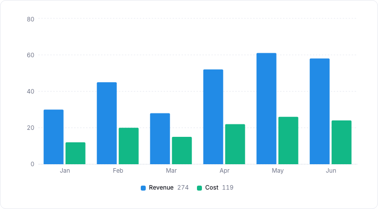
A bar chart comparing two series across categories.
When to Use a Bar Chart
- Sales Pipeline: Compare the number of deals or total value across different sales stages.
- Support Volume: See which product areas or categories generate the most support tickets.
- Team Performance: Compare task completion rates or response times across different team members.
- Customer Segmentation: Visualize the distribution of your customer base by industry, region, or plan type.
Configuring a Bar Chart
Dimensions (X-Axis)
Choose the categorical property you want to compare.- Example:
Status,Owner,Industry.
Measures (Y-Axis)
Choose the numerical value or aggregation you want to visualize.- Example:
Count of Records,Sum of Value,Average Resolution Time.
Grouping (Optional)
Add a secondary dimension to create grouped or stacked bar charts.- Example: Group sales stages by
Regionto see how different areas are performing.
Best Practices for Bar Charts
- Limit Categories: If you have too many categories, the chart can become difficult to read. Consider using a “Top N” filter or grouping smaller categories into “Other”.
- Sort Logically: Sort your bars by value (descending or ascending) or by a natural order (e.g., sales stages) to make trends easier to spot.
- Use Clear Labels: Ensure your axes and legend are clearly labeled so that anyone can understand the chart at a glance.