

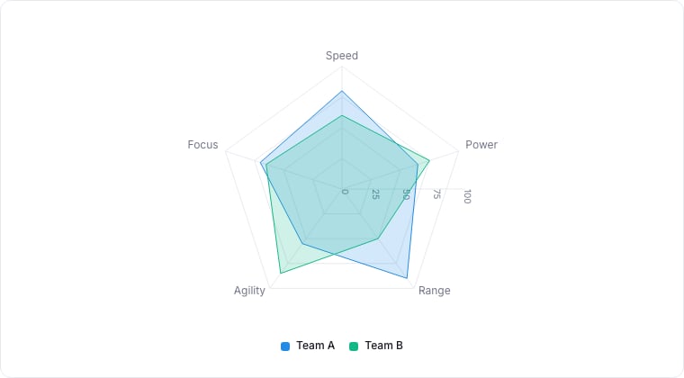
A radar chart comparing two groups across five dimensions.
When to use
Radar charts plot many metrics around a polygon. Use them to compare two or three records (or two or three time periods) across the same set of metrics: sales rep skills, account health dimensions, customer profile attributes.Required data shape
- Axes: 3+ numeric properties to plot per axis.
- Series: each series is one record (or one group); 1-3 series ideal.
Configuration
Limitations
- Three or more series get tangled. Use small-multiples instead.
- Axis order matters visually, adjacent metrics imply correlation that may not exist.