

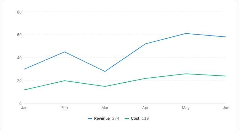
A line chart plotting two series over six months.
When to use
Line charts are the right tool for “how did X change over time” questions. Use them for deal velocity, ticket throughput, NPS over weeks: any continuous trend.Required data shape
- X axis: a date or ordered numeric property.
- Y axis: a numeric or aggregated property.
- Group (optional): select property; each group becomes its own line.
Configuration
Limitations
- More than ~5 series in one chart becomes hard to follow. Use Composite or split charts.
- Sparse data leaves visual gaps; consider Area for cumulative views.