

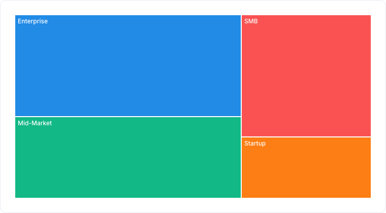
A treemap sizing each category by its share of the total.
When to use
A treemap shows parts of a whole as packed rectangles, each sized by its value: revenue by product line, deals by stage, storage by team. It fits many categories into a fixed area, so it beats a Pie or Donut when you have more than a handful of categories but still want proportion at a glance.Required data shape
- Group: a categorical property whose values become the rectangles.
- Value (optional): a numeric property aggregated per rectangle; defaults to a record count.
Configuration
Limitations
- Great for proportion, poor for precise comparison. Small rectangles are hard to read exactly. Use a Bar chart when exact values matter.
- Very high cardinality yields slivers too small to label; filter to the top categories.
Troubleshooting
Related
- Pie / Donut, share-of-whole for a few categories.
- Reporting overview