

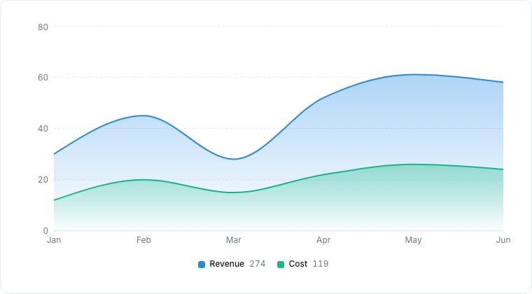
An area chart, the same series, filled to show volume.
When to use
Area charts shine when you want to show how a value (or a few values) accumulates or evolves over time, and you want the magnitude (not just the trend) to feel visceral. The shaded area communicates volume.Required data shape
- X axis: a date or ordered numeric property.
- Y axis: a numeric or aggregated property.
- Group (optional): a select / status property; each group gets its own stacked layer.
Configuration
Limitations
- Stacking with more than ~6 groups becomes unreadable. Use a Top-N filter.
- Sparse data series produce visual gaps; switch to a Line chart if you need precise endpoints.