

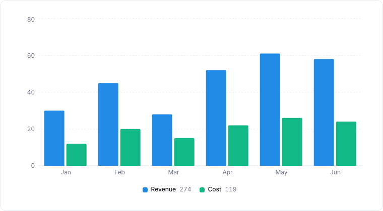
A composite chart combining bars and a line in one plot.
When to use
Composite charts overlay multiple series of different chart types on a shared x axis. Use them when you want to show a primary metric (typically as a bar) and a secondary related metric (typically as a line), for example, deal count and conversion rate over time.Required data shape
- X axis: shared by all series.
- Series: one or more series, each with its own type (
bar,line,area) and y property.
Configuration
Limitations
- Two series is the sweet spot; three is the upper limit for legibility.
- Pick differing scales carefully. If the secondary metric is much smaller than the primary, use a dual-axis view.