

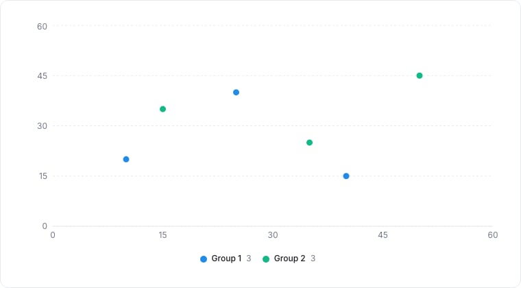
A scatter chart plotting two groups of points.
When to use
Scatter charts plot one numeric metric against another, one dot per record. Use them to spot relationships, outliers, and clusters: deal value vs days-in-stage, NPS vs MRR.Required data shape
- X axis: numeric property.
- Y axis: numeric property.
- Color (optional): select property to color dots by category.
Configuration
Limitations
- More than ~500 dots becomes a noisy cloud. Add a filter or sample.
- The trendline is a simple linear regression; treat it as a visual aid, not statistical truth.