

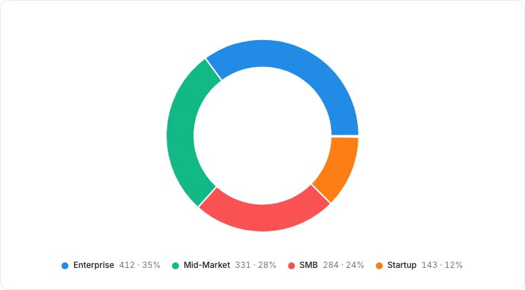
A donut chart with its legend showing value and share.
When to use
Donut charts answer “what share of the total is X?”. Use them when you have a single categorical breakdown of a single measure and want to communicate proportion. The donut shape leaves a center for a headline metric.Required data shape
- Group: a select / status property.
- Value (optional): numeric property aggregated per group; defaults to record count.
Configuration
Limitations
- Five or fewer categories. More than that, switch to a Bar chart.
- Donuts are notoriously bad at showing precise differences. Use them for ratios, not exact numbers.